Vertafore Agency Platform
Vertafore needed a dashboard application that will provide users with a single login ID and bring together their diverse range of software applications into a single, comprehensive solution. Vertafore has many related applications such as client management systems, producer tools, and document management systems. Vertafore grew their product line be acquiring companies that had key software applications that were missing in their product line. As a result, each software application has a different UX/UI, taxonomy for common commands and also a different database system. The Vertafore Agency Platform dashboard will provide a single starting point for user workflows and status overview for all projects. An insurance agency staff has many different types of users such as customer service representatives, producers, and bookkeepers.
Project Duration
Between February-June 2014, I worked on this dashboard project for Vertafore. Workflows were validated for customer service representatives and accounting users at insurance agencies.
My Role
As Senior UX/UI Designer, I worked closely with product managers, UX researcher, and technical writers to define content, visual interface, UI text, and interaction patterns. I also worked closely with engineers and product managers to identify product specifications and a reasonable product scope.
Personas
The first project involved updating personas for various roles in an insurance agency. Existing personas needed to be updated. I updated the personas with insights gained from participation in field studies at various insurance agencies in Colorado, California, and New York. Research also included conversations with subject matter experts at Vertafore who were previous owners or producers in an insurance agency.
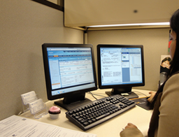
Personal lines insurance agent working on Sagitta, one of Vertafore’s agency management systems
Scenarios
Workflows for policy submissions are transferred from one agency user to another (e.g. producer to customer service representatives to bookkeeper) throughout a project. To understand these complex workflows, I started with a poster to visualize a typical day for users in an insurance agency. This wall poster was 16-feet long and showed 5 typical users: office manager, agent or producer, accounting manager or bookkeepers, customer service representatives for commercial or personal lines of insurance. The purpose of the poster was to show project dependencies such as when producer is waiting for the customer service representative to complete their portion of the workflow.

Scenario wall poster showing a day in the life of insurance agency users
User Requirements
While the business goal for this dashboard project was primarily a single sign-on process for Vertafore’s products, this poster visualize concrete user needs for product management. This poster helped me to identify key user requirements such as the ability to see an overview of multiple projects or to search for clients across multiple databases. It also provided Vertafore's training team with content to develop new training modules.
Sketching Ideas
Ideas can come from anywhere - product managers, engineers, or QA team members. Sketching is a quick ideation process and allows other team members to be involved. Sketches look unfinished and encourage team members to express their point of view. Using these insights gained from the sketching process, fast reiterations were made that defined the elements and content of the dashboard. Complex interactions patterns could be understood and visualized by all team members.
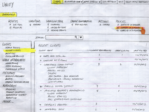
Early sketch - Investigating ribbon interaction pattern for Vertafore Agency Platform

Another early sketch - Investigating ribbon interaction pattern for Vertafore Agency Platform
Validating Conceptual Model
The initial set of low-fi wireframes allowed me to formulate and incorporate other’s ideas into a cohesive product structure. These wireframes with the wall poster and persona research were presented to product management and engineering teams. This work helped others to understand and visualized the product. I gained approval from key stakeholders.
Working with the UX Researcher, the first round of exploratory research was started. These low-fi wireframes were used to validate the dashboard with users. Following a rapid iterative testing process, I revised the interface design after research sessions. Content development was refined and the UI was validated with customer service representatives for commercial and personal lines of insurance.

Lo-fi wireframes for client search interface
After successfully validating the UI with customer service representatives, the UX Researcher and I decided to interview accounting users. This was not successful. We went back to the drawing board and talked with internal expert users and trainers who work specifically with the accounting users at insurance agencies. More interface revisions were needed. The UX Researcher and I started another round using the rapid iterative testing process. This time, we got it right.
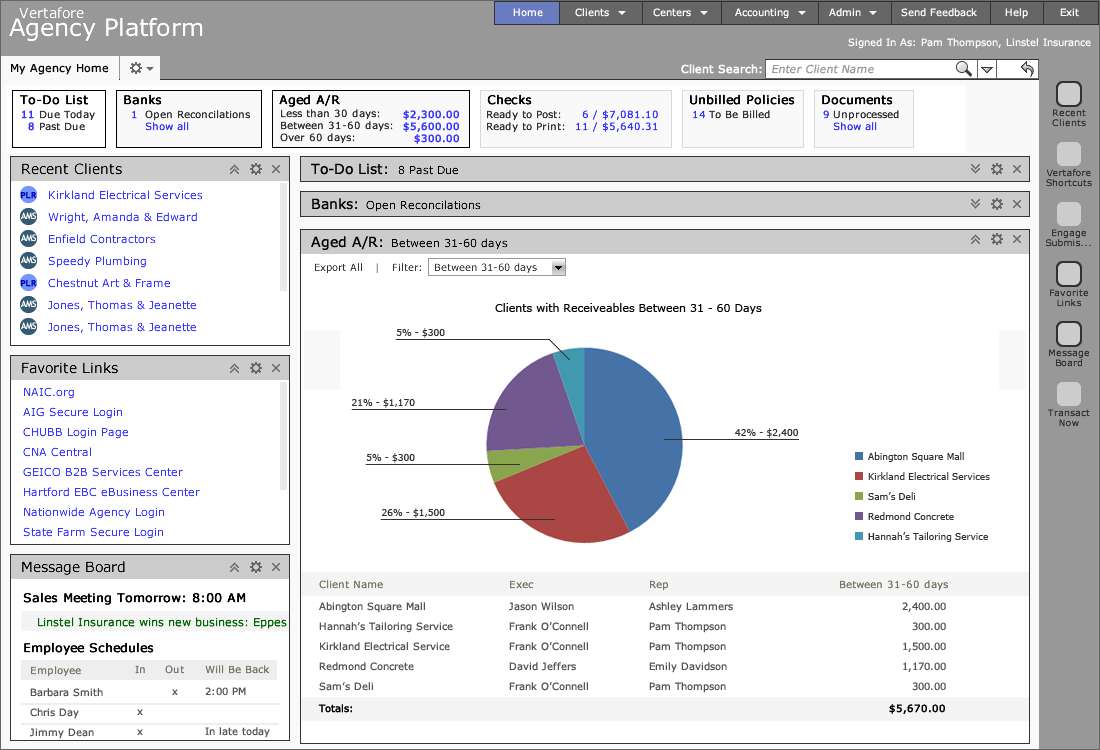
Lo-fi wireframes for accounting dashboard
Information Architecture
Critical user journeys were validated during these research sessions for the policy renewal process from an expiring policy to new submission. A key feature of the design proposal was the ribbon element that displayed project status overviews. During exploratory research, customer service representatives and accounting users immediately saw how the ribbon could be used and told us how to organize it. They perceived the ribbon as a tool to track progress on large projects and monitor incoming work.
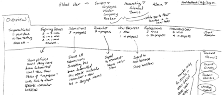
Drawing for ribbon organization
We revised the ribbon organization based on feedback from customer service representatives. The ability to track the process of quoting, submitting and servicing insurance policies are basic user requirements for customer service representatives servicing commercial or personal lines of insurance.

Diagram showing how workflows move from one status to another
Defining Product Scope
As Senior UX Designer, I worked closely with engineers and product managers to identify product specifications, content and reasonable product scope. Using scenarios and storyboards, I was able to visualize the end-to-end experience for product managers, business analysts, engineers, and QA analysts. The project scope was negotiated with the product team.
Since the unified database and many of the shared components would not become a reality for version 1, the focus for the initial release was to provide users access to multiple databases with the ability to start or resume workflows across applications using the ribbon component.
Spreadsheet showing ribbon content for each user role
The UX researcher and I organized meetings with product teams across Vertafore to obtain feedback about the dashboard and ribbon component. We used these meetings to communicate the product goals, strategy, and structure. We made requests for work items on each product team’s backlog for ribbon and panel components.
Throughout this process, we encouraged product teams to focus on the end-to-end user experience. Previously, each product team was accustomed to just throwing API integration code over the fence to other product teams with no concern for the complete user experience.
Front-End Interface
During the content scoping discussion, I worked closely with a front-end engineer to create an interactive portal model that would provide a flexible and robust dashboard while addressing the rigidity of the Sencha controls libraries that were being used to implement this dashboard. We collaborated on making the interaction patterns usable and achievable using the Sencha library. Patterns that needed to be defined were how users would display dashboard, ribbon or side panel content; hide/show cards or panels; and reconfigure cards or panels based on user preferences.
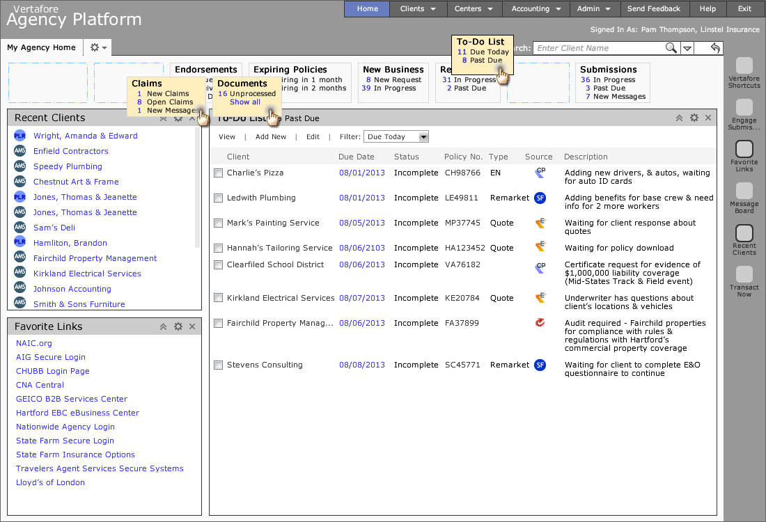
Interaction patterns for ribbon control using Sencha control library
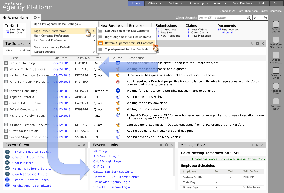
Interaction patterns for dashboard panels using Sencha control library
Managing Quality
Guidelines help the QA team to maintain quality and test accurately as well as provide supporting documentation for technical writers to create training materials or help articles. Here are 2 guideline examples that I created to explain the style guide and interaction pattern for buttons (a foundational building block for the user interface unit) and dialogs (a complex UI component that is composed of smaller, simpler components with unique properties and functionality). These guidelines are distinct patterns that can be used over again.
Outcome
This project was not complete by the time I left Vertafore; however I was able to get cross-product teams talking and working together. This is a significant accomplishment because Vertafore has a history of developing products in silos.
“When I am working on a problem I never think about beauty.
I only think about how to solve the problem.
But when I have finished, if the solution is not beautiful, I know it is wrong.”
— Buckminster Fuller
![]()
