Google DoubleClick Search: Bid Health Overview
When using DoubleClick Search bid strategies, paid-search advertisers required a lot of training and handholding from product support account managers. Tier 1 DoubleClick advertisers were able to get the necessary support; however smaller advertising agencies were not able to get support and were not using bid strategies effectively. Google makes a significant profit from these advertisers; there is an essential trust issue. Can these advertisers trust Google to spend their money wisely when it is managed by a bid strategy?
Project Duration
This project started with design sprints and brainstorming sessions that included UX, product management, and engineering prior to my involvement. I started work in late 2015 by preparing wireframes for research studies. My work was completed by late Spring 2016 after the structure and UI layout was defined; however this feature launched after my contract was complete.
My Role
As UX/UI Designer, I worked closely with engineers, product manager, UX researcher, technical writer, and product support account manager to improve usage and trust for DoubleClick Search bid strategies.
Research
In late 2015, I create a series of wireframes based on common bid strategy usage scenarios. From the research study, we heard from users about their expectations for the bid strategy health overview dashboard. We learned which recommended improvements they would or would not apply. As expected, there was significant push back for automatically applying Google’s recommendations to increase campaign budgets.
Minimum Viable Product Definition
This research study and a document created by the engineering team defined the minimum viable features for the first release of this feature. The engineering document defined what could feasibility be returned to the UI for each bid strategy issue. I revised wireframes based on this feedback. The PRD (Product Requirements Document) from product management defined goal and strategy; however these wireframes defined specific content and structure for the bid strategy health overview cards.

Bid strategy overview card with significant performance issue
Content and Icon Development
Critical to this project was the creation of clear messaging using UI text and icons. I worked closely with a visual designer to develop icon graphics for multiple usage states of the bid health status. I also worked with a technical writer to write content for bid health issues and recommendations. After defining the content for the overview cards, I organized a meeting with Google’s i18n internationalization committee and key team players to review the UI text.
Health status icons for bid health overview cards and annotated timeline
Critical User Journey
With careful considerations, I was able to design the user interface so that trust was created between DoubleClick Search and large advertisers. The Overview cards provided detailed information about how each actionable step would improve bid strategy performance. Here are some examples of the revisions that I made to critical user journeys.
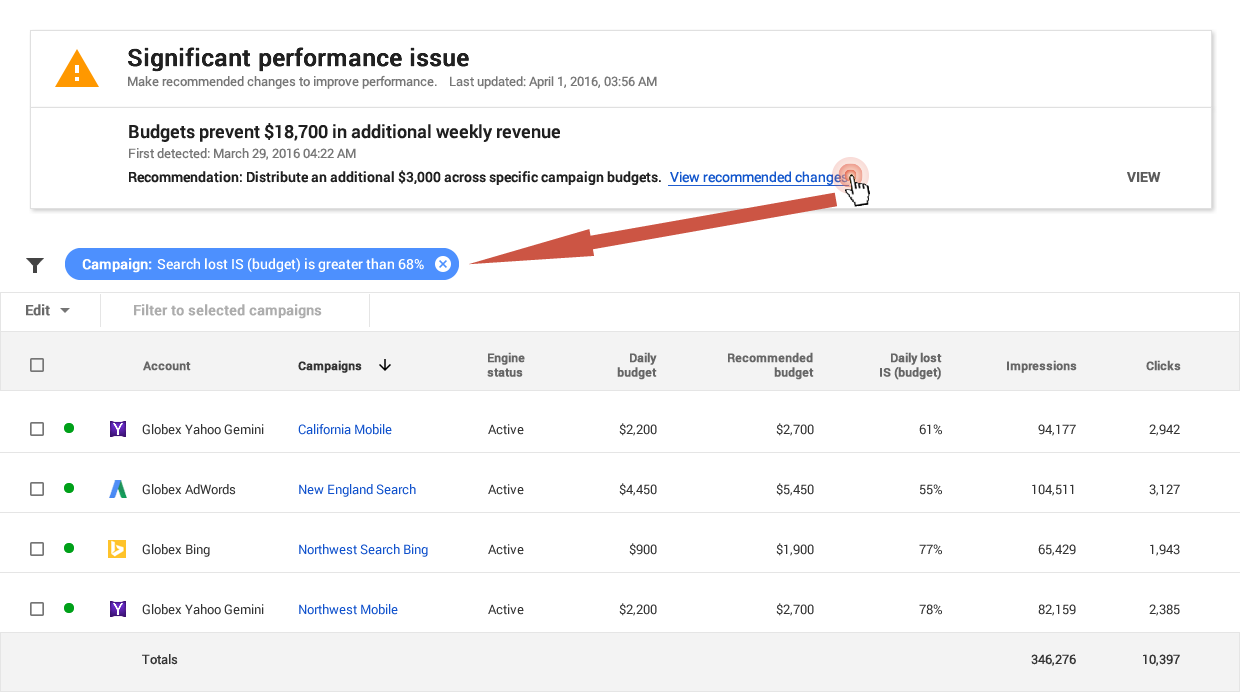
Campaign Budgets: The first issue that surfaced was that advertisers did not want Google to automatically increase campaign budgets. Advertisers need control over campaign budgets and advertising agencies are often constrained by their client’s requirements. Advertising account managers need the ability to view budgets that are constrained and compare current budgets to recommended budgets. The engineering team recognized that the number of constrained budgets could change over a short period of time - either increasing or decreasing based on the time of day or day of the week. Users might view this behavior as inconsistent. Therefore, automating a health issue fix for campaign budgets would be problematic.
My role was to convince product manager and engineers to listen to user needs that were clearly articulated during research studies. I recommended that the apply button be removed from the overview card and instead provide advertisers with the ability to view all campaign budgets that have constrained budgets. Advertisers could make adjustments to campaign budgets as needed and in consultation with their clients. Since a date/time stamp is marked on the Overview page, an advertiser should not expect that health status to change until the date/time stamp is updated.

Campaign budget overview card and bid strategy campaign page
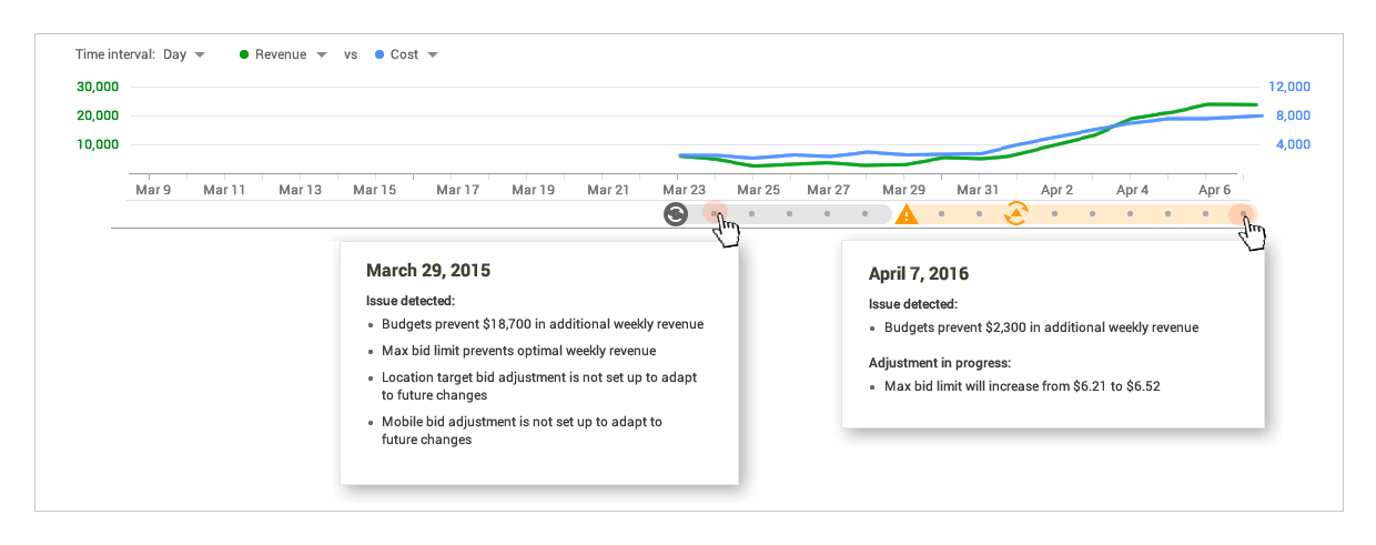
Annotated Timeline: On the Bid Strategy Overview page, an annotated timeline was displayed to show bid strategy progress improvements. This annotated timeline was displayed below a line chart with key statistical data. Advertisers can specify which variables appear on the line chart. Some examples are revenue, cost, or conversions.
This timeline provides advertisers with the ability to view historical data and understand when the bid strategy moves from a learning period into a different status - either no known issue, warning or critical status. A fly-out card will appear for each date on the annotated timeline when there is a learning, warning, or critical status.
In my role as UI Designer, I applied existing AdWords patterns to the annotated timeline and fly-out cards. I completed the layout for the fly-out card and defined the content. I revised the status icons for usage on the timeline.

Annotated timeline showing fly-cards for learning status and warning status
Interaction Pattern for Action Buttons: To view more details, advertisers can click on the view button for each overview card. For instance, on the Overview card for Max Bid, details are displayed to show the max bid amount prior to the adjustment, for the latest update and for the next adjustment. Advertisers have the ability to pause this health fix at any time. Since establishing trust between Google and advertisers was a goal, allowing advertisers to control when to apply or pause adjustments is an important aspect of this interface.

Max bid overview card with minor performance issue and adjustment in progress
In my role as UI Designer, I applied existing AdWords patterns to Overview cards and created the visual layout and content for each card. Working with the engineering team, I determined what content could be displayed. Finally, I worked with technical writer on the UI text for each card and then lead the review process with Google’s i18n internationalization committee to assure that the UI text would work well when translated.
Outcome
When my contract at Google ended, this project was still in development. However, here is the last email from the Product Support Account Manager for DoubleClick Search:
Pat, thank you so much for all your hard work on bid strategy health monitor! It was a very complicated design with many moving parts; your ability to ask tough questions and build quick mocks on-the-fly was critical to getting the design just right. I'm super confident our users will love it and find it intuitive & easy to use.
“When I am working on a problem I never think about beauty.
I only think about how to solve the problem.
But when I have finished, if the solution is not beautiful, I know it is wrong.”
— Buckminster Fuller
![]()
