Astonish Results: Lead Generation Tool
Astonish Results was in the process of developing the next generation platform for their lead generation application. The product team had already started development; however they were having significant issues with user acceptance and needed UX/UI Designer on their team.
Project Duration
I worked remotely with the engineering team that was located in Rhode Island. I started after the engineering team had developed a significant portion of the back-end and front-end for this application, so I had to quickly work to catch-up. I worked from February to June 2014 until being laid-off in a large company-wide layoff event.
My Role
As UX/UI Designer, I designed the overall navigation and framework for this lead generation application by providing interaction patterns and UI layouts for search, auto-save, task list components, and all entry forms. I detailed and documented all workflows for the critical user journey from the information collection stage to submitting the insurance application. Interface layouts were needed for desktops and mobile devices.
Information Architecture
Although the framework for the contacts list and the task list was built, I changed how these two lookup controls worked together. I improved the search UI to filter both the contacts list and the task list. Insurance agents will have the ability to find clients by searching the contacts list or task list with 1 search query. After finding a client, the agent can link directly to the next workflow step using the task list. The task list shows current status for the insurance quote and provides links to continue the workflow. Also, I revised the client information bar to show all uninsured risks, client contact information and the current step for workflows.
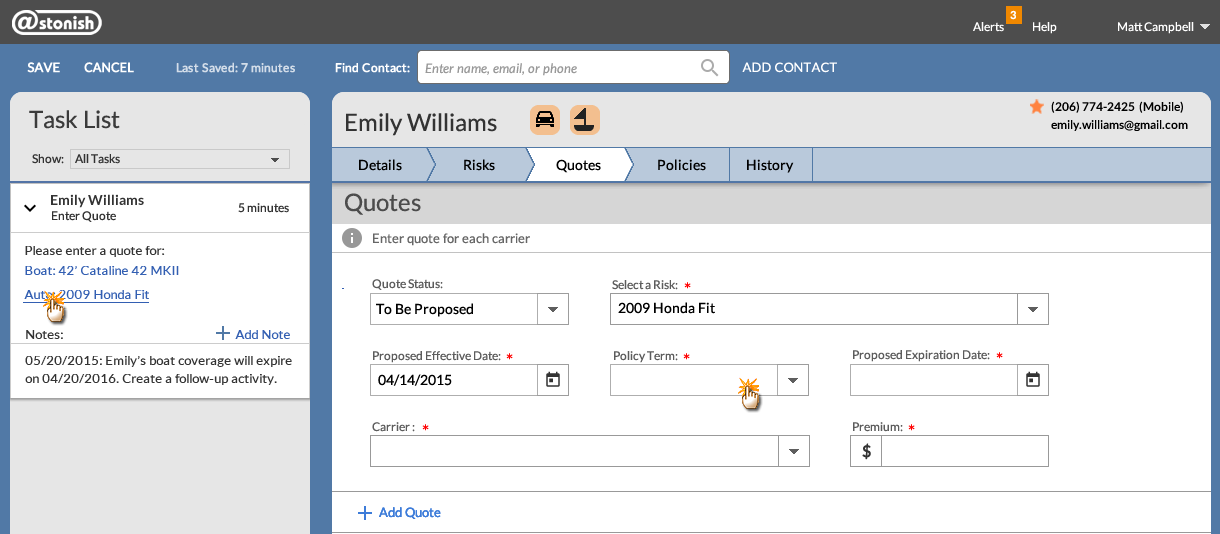
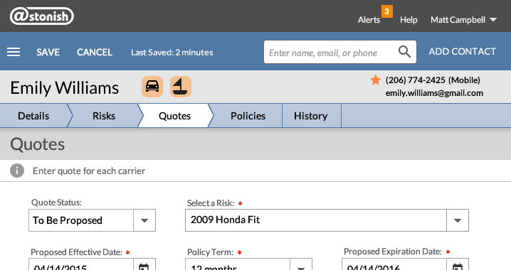
Quotes form for uninsured auto risk
Insurance agents can find their most recent work using the task list because the default sort method is date/time of last update. Notifications for new insurance quotes are indicated in the product’s top bar and are also indicated on the task list with a vertical bar. Tasks with notifications are always displayed at the top of the task list.
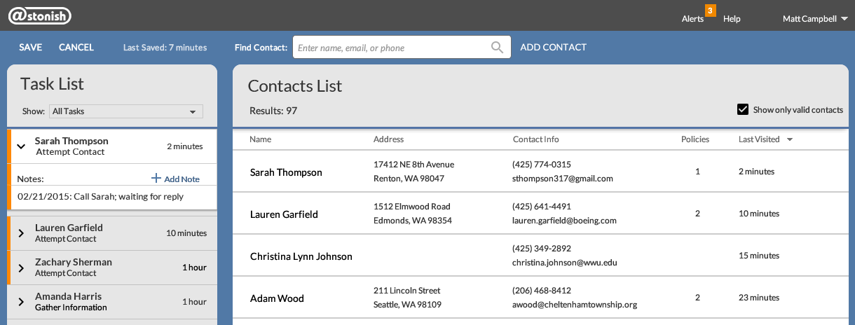
Unfiltered results for contacts list and task list
Research
After revising the information architecture, I wanted to verify that the revised user experience would receive user acceptance. I engaged some local clients and presented a complete walk-through using the revised wireframes. We quickly realized that this new user experience gained approval.
Content and Icon Development
Critical to this project was the creation of clear UI messaging using both text and icons. I created the workflow process indicator so insurance agents can see at a glance the next step in the submission process. Large insurance agencies are rapidly hiring new agents to replace expert agents who are retiring. These agencies need their employees to understand and correctly proceed through all the steps in the complex insurance submission process.
One of the features for this lead generation tool is tracking uninsured risks. Insurance agencies are always looking for ways to sell more insurance to their current clients. Using font-awesome icons, I created graphic indicators that would show uninsured risks for each client.
Crafting UI messages is essential to providing a clear path from one workflow step to another. The UI text is the glue between user and interface. Without clear messaging, users can become confused. Because I earned a CISR (Certified Insurance Service Representative) certificate while working at Vertafore and therefore had an understanding of the insurance application process, I was able to write the UI messages for each workflow step and status.

Contact header, workflow progress indicator, uninsured rick icons
Critical User Journeys
Search UI: I revised the search interaction pattern by allowing insurance agents to search using client’s name, email address or client’s company. Search hits were indicated using highlighted text, so it would be easier for agents to determine how each search result matches their search query. Also, I requested an additional change for the task list. I recommended that the task list be filtered based on the agent’s search query.
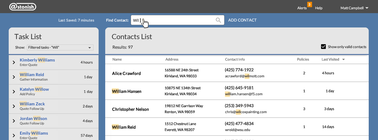
Results for search query “Wil” are displayed in contacts list and task list
Auto-Save Pattern: I researched and recommended an auto-save interaction pattern. Since insurance agents are constantly concerned about E&O (Errors & Omissions) liability issues, it was important to display save and cancel buttons. During walk-through sessions, insurance agents expected these forms to auto-save; however providing a Save button was considered important due to E&O concerns. Auto-save also works for task list.
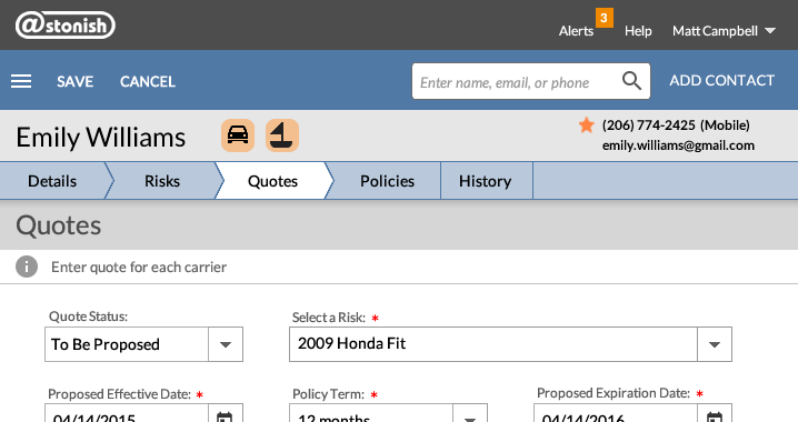
Auto-save feedback when user opens form from any link

Auto-save feedback after user makes first entry on any form
Progress indication with message “Saving” displayed
Auto-save feedback after user completes all form entries
“Last Saved” message is displayed with time stamp
UI Layouts - Responsive:
There are many workflow steps for the insurance application submission.
This critical user journey needed to be completed without causing additional or unnecessary work because the lead generation tool did not contain complete client records; those records are maintained by the client management system.
The interface layouts needed to support quick and right user decisions but only capture basic client data needed to track insurance application submissions.
I created layouts for each workflow to show end-to-end scenarios from initial information collection stage to submitting the insurance application.
Layouts were created for desktop, tablet and phone devices, so insurance agents can service their clients anywhere.
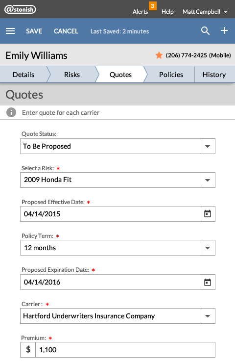
Phone layout for quotes form
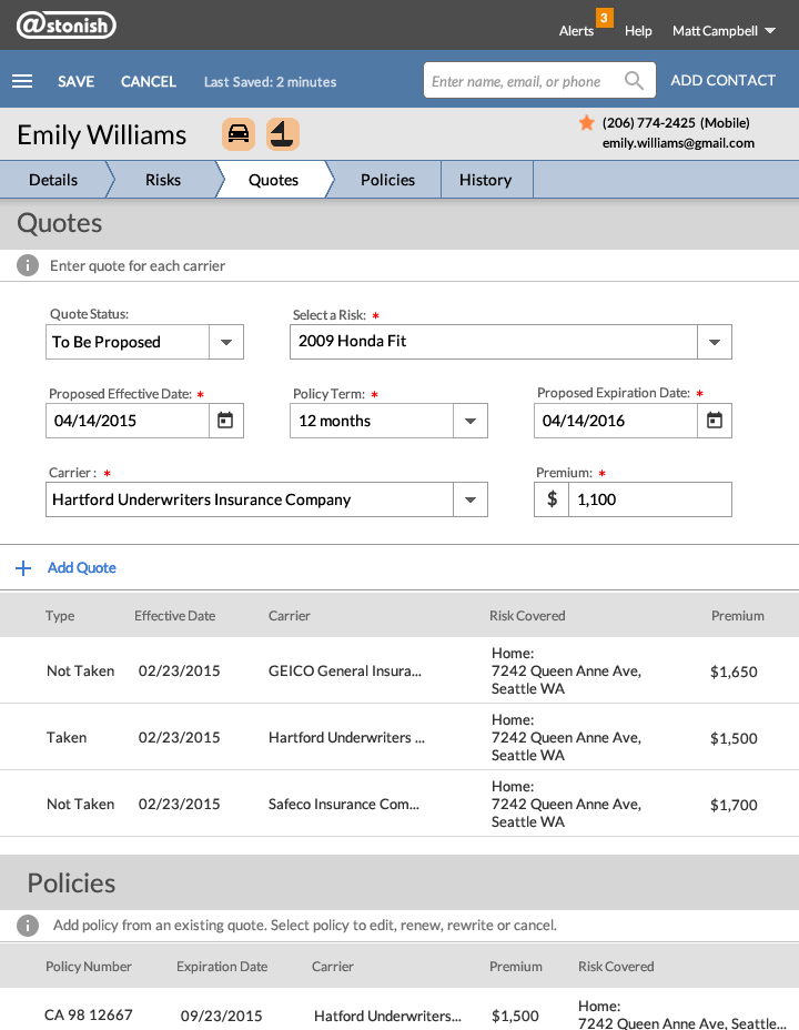
Tablet layout for quotes form
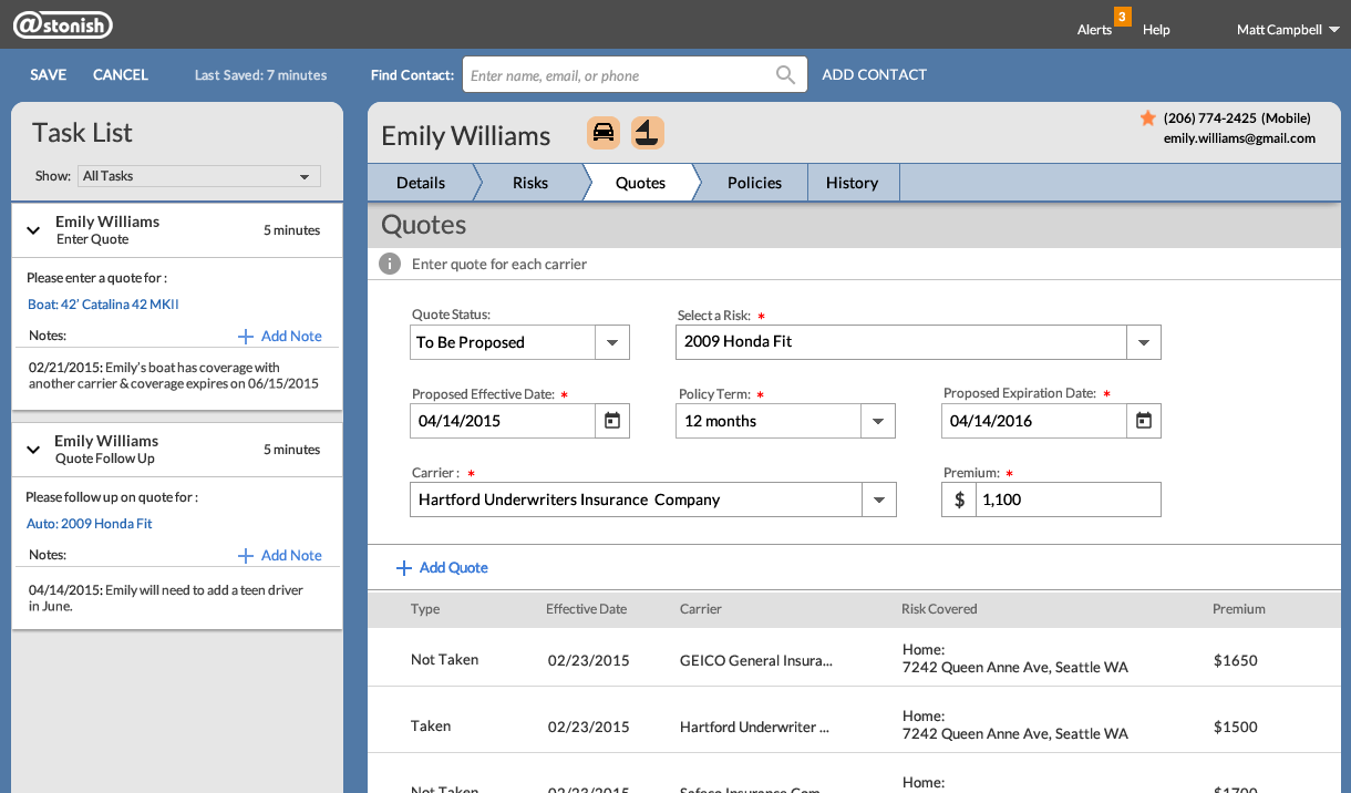
Desktop layout for quotes form
More Efficient Workflow: After the insurance agent links to a client record using the task list, the context-sensitive link will open the appropriate form and will pre-fill basic information. Also, after indicating policy term, expiration date field will be pre-filled.
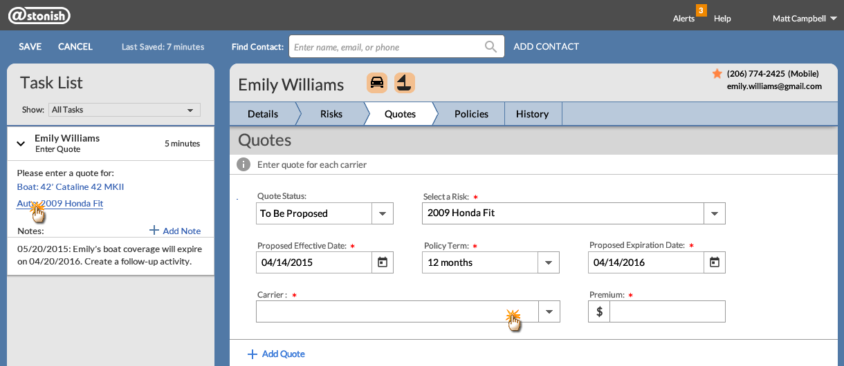
Task list links and opens quotes form with information pre-filled
The notes section for the task list allows the insurance agent to keep track of their conversations with clients. This is necessary and helps to address E&O (Errors & Omissions) liability issues. The Enter Quote task card keeps track of uninsured risks, so the agent will have an opportunity to ask about those risks and possibly sell more insurance. The auto-save feature is activated when a new note is added to the task list.
Managing Quality
Supporting the engineering team is a critical step in the complete product development process. I wrote interaction guidelines, created redline specifications, and provided production-ready graphic assets. With this information, the QA team was able to accurately test complete workflows and maintain high-quality control.
Outcome
In June 2014, the lead generation application received significant user acceptance and gained approval from a major customer. The engineering team made significant progress towards developing the platform for the next version of this tool. Because of this progress, the Board of Directors decided to keep a bare-bones staff to allow completion of this major revision. Although I was laid off prior to beta release, the team met their deadline. At the beta release retrospective, the engineering team recognized that I played a key role in helping them meet their deadline. The Board of Directors eventually sold off this operation to Zyware. Here is a recommendation from one of the product managers that I worked with at Astonish Results:
Pat joined the Astonish Team at a critical juncture in the development of our new platform and was asked to perform a monumental task of coming up to speed and designing a complete UI model virtually overnight. She did just that... Pat quickly became familiar with our product proposition and began adding value immediately by designing views, figuring out and testing interaction models and providing mockups to our development team. In just a few short weeks, Pat closed the gap between our product vision and providing a complete UI and UX model that received accolades from every stakeholder and client we showed it to. Pat played a pivotal role in hitting all of our goals for our first release. I would recommend her highly and would happily work with her again.
“When I am working on a problem I never think about beauty.
I only think about how to solve the problem.
But when I have finished, if the solution is not beautiful, I know it is wrong.”
— Buckminster Fuller
![]()
