Google DoubleClick Search: Material Redesign
DoubleClick Search engineering team wanted to reuse AdWords Next UI components but those components were being developed using DART with Google Material styles. Since the engineering team was not ready to update the code base to DART, UX and engineering teams decided to update DoubleClick Search’s visual interface (or CSS styles) to Material styles so it would be possible to insert AdWords Next UI components into the GWT framework.
Project Duration
This project started in mid 2015 and released to DoubleClick advertisers in April 2016.
My Role
I was the lead designer responsible for all interaction and redline style guides as well as defining exit criteria for this project. I investigated AdWords Next and Material design styles to determine styles and patterns that could be used for DoubleClick Search. I was responsible for getting buy-in from product management and engineering.
Usability and Affordances
Material design primarily uses animation for affordances and user feedback. For instance, when a user clicks to display a menu, the menu opens using an animated transition and often the menu will replace the button or command name. The existing GWT framework did not use CSS3/HTML5, so animation could not be used to provide user feedback. Buttons needed affordances, not only for hover or pressed states but also selected states. Menu command states also needed to be defined. I extended DoubleClick Search’s version of the Material style guide to include non-animation button and menu command states
Improved Messaging
There was inconsistency with how messages were displayed in DoubleClick. I started by categorizing message types. Depending on where the message was displayed in relationship with the UI component, I revised and solidified a consistent UX pattern for all messages. Guidelines explained where, when, and how to use each message type. Redlines specifications were provided. Here is a link to the guidelines that I wrote for DoubleClick Search Messaging.
Tables and Information Density
Google’s Material style guidelines were developed primarily for mobile devices. DoubleClick Search users primarily use desktop interfaces. Using quantitative data to understand common browser window sizes, I determined that at least 80% of DoubleClick Search users had displays larger than 1440x900. This informed decisions about information density for table layouts.
Initially AdWords Next was using the pre-defined spacing from Material style guidelines. Based on the quantitative data analysis and listening to users in various UX research studies, I determined that we needed a denser layout. Large advertisers needed to be able to scan table data quickly; so using a denser row height is better. After DoubleClick Search implement the denser specifications, AdWords Next UX Researchers engaged beta users about preferences for table density. Many users selected a denser table layout. AdWords Next changed the table specifications to reflect these preferences.
The below table shows comparisons between Kennedy styles (previous Google guidelines) with Existing (or Google’s company-wide) Material styles and Revised (or DoubleClick/AdWords variation) Material styles for row height and column spacing.
| Kennedy | Existing Material | Revised Material | |
|---|---|---|---|
| Row height | 45 | 56 | 42 |
| Spacing between columns | 32 | 56 | 48 |
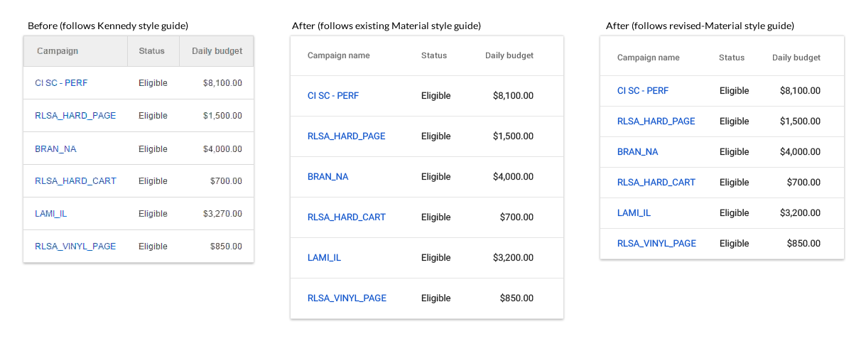
Comparison for tables - row height
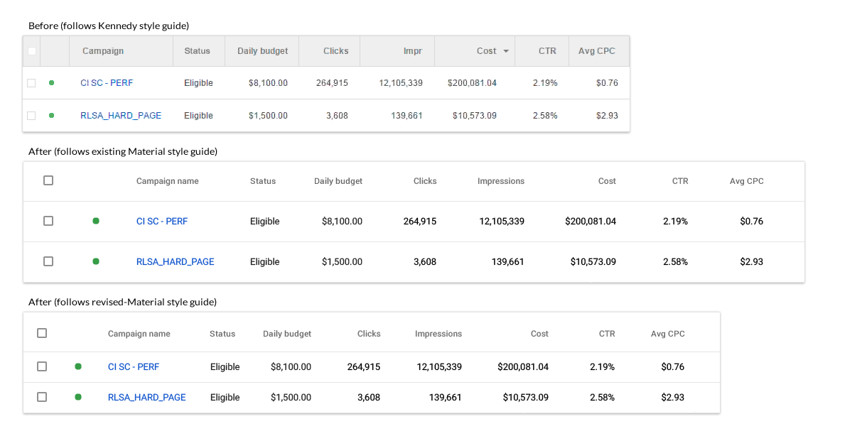
Comparison for tables - column height
Information Architecture: Primary Navigation
At the beginning of this project, I convinced product management and engineering teams to update DoubleClick Search’s information architecture. I created a proposal for updating the multi-tier navigation system (sidebar and context-sensitive tab bars) based on user feedback.
The sidebar navigation was reorganized to align with with the user’s mental model based on a card sorting research study completed about a year prior to starting this work. The below graphic also shows the visual updates for Material styles.
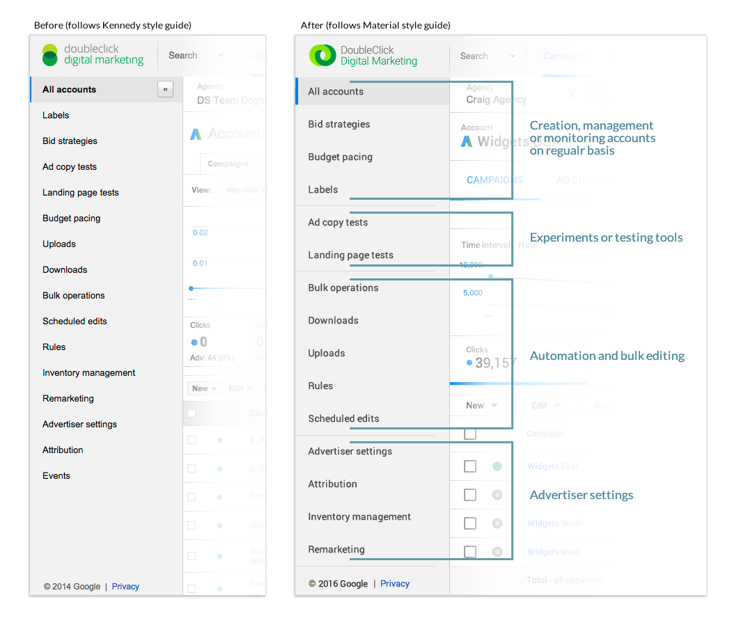
Comparison for sidebar or primary navigation
Information Architecture: Secondary Navigation
DoubleClick Search also has an extensive secondary navigation using a horizontal tab component. The number of tabs continued to increase. The tab bar was so long, it was causing users to horizontally scroll to view key interface components such as a date selection control that was attached to the right border.
Product managers believed that if their features appeared on either the primary or secondary navigation, it would be used frequently. The product managers were not thinking about how their features would be used in a common workflow.
Because of the Material design styles, the tab bar would become even wider. There were 2 options: either add command buttons so that the entire tab bar would scroll or reorganize the existing tab bar so that it would have 2 tiers of commands. This would create a second and third layer for the navigation system.
The product team agreed that the reorganization solution would work as well as be a less expensive engineering solution. UX agreed because that would allow DoubleClick Search’s navigation to be more closely aligned with AdWords Next navigation. I created a new structure and a UX researcher ran the research sessions. We made a few modifications to the proposal. When I presented the proposal to the product team, a quick approval was given. The front-end engineering team took on this project as a PE Fix-It project (Google’s product excellence initiative for improving the critical user journeys).
The below graphic shows the visual updates for Material styles and reorganization for the tab bar. A common workflow for DoubleClick users is to update and modify keywords. This reorganization made it easier for users to manage keywords. Some users stated that they did not know that DoubleClick Search had negative keywords, although it had been a feature of DoubleClick Search for a long time.
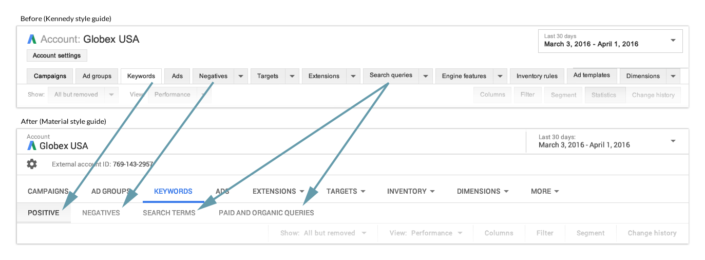
Comparison for tab or secondary navigation
Design Challenges
There were a number of unique design and layout challenges. When we started this project, Material design did not have patterns for indicating page hierarchy or for complex components such as radio button groups or related form fields.
Radio Button Variations: Material design specifications for radio buttons were basic and did not include the option of providing users with additional choices or informational messages.
DoubleClick Search provided paid search advertisers with the ability to define scheduling parameters for campaigns or ads. These radio buttons have additional parameters based on how a paid search advertiser wants to define the schedule. In the Kennedy style guide, these parameters appeared below the radio button group. For the Material style guide, we asked that these parameters appear in the context of the radio button control. In both Kennedy and Material style guides, the additional controls would appear/disappear based on the radio button selected.
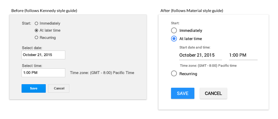
Comparison for radio buttons for “At later time” option
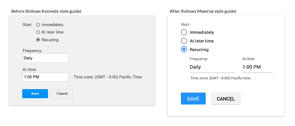
Comparison for radio buttons for “Recurring” option
DoubleClick Search advertisers need the ability to understand how bid strategy goals will have an impact on their campaigns. Providing informational messages for each radio button option aids users in making a decision about the bid strategy’s KPI goal.
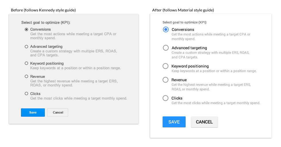
Comparison for radio buttons with informational messages
Unique Form Elements: When DoubleClick Search advertisers create a landing page test, they need the ability to define each landing page with a “user-friendly” name, URL for each landing page and the percentage of traffic to push towards each landing page. Material design did not have styles defined for creating form field groups.
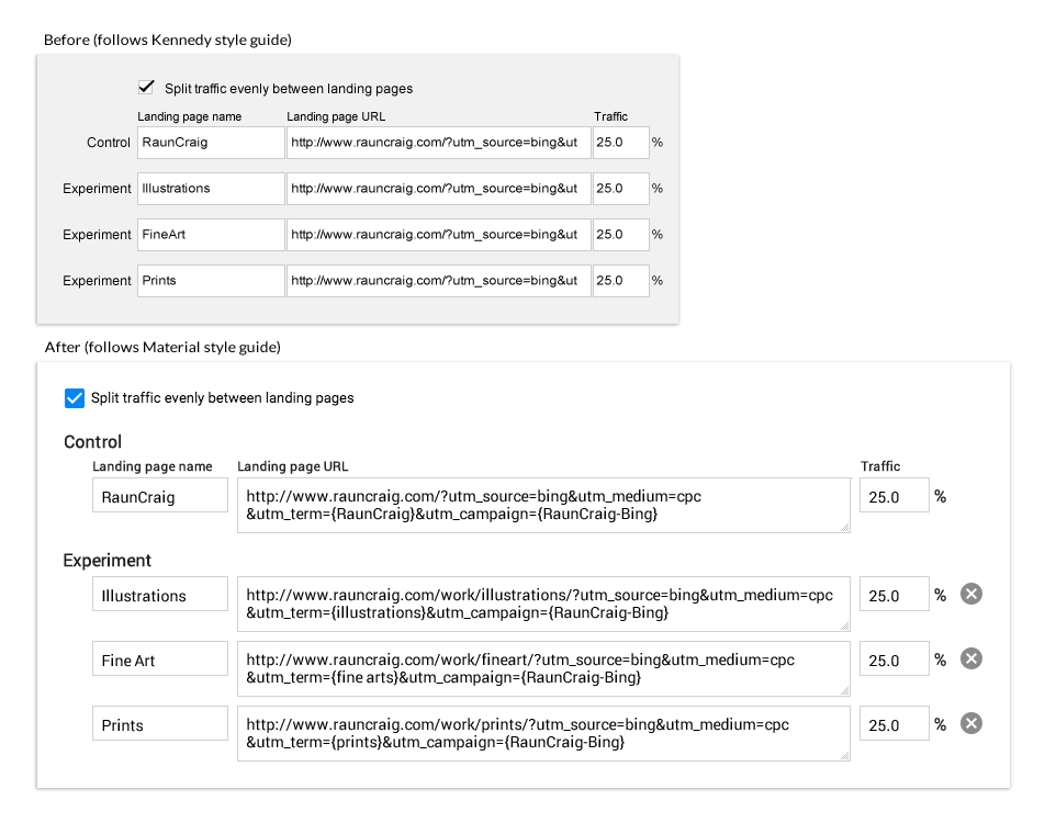
Comparison for form fields - landing page tests
Exit Criteria
As the engineering team worked through various pages, the lead front-end engineer and I kept finding layout exceptions to the basic design patterns for Material styles. Some of these exceptions could potentially cause user errors. I created a measurement scale to categorize the severity of the visual bugs and explained how to rate these bugs. This document was useful in helping the product team (product managers, engineers, and UX) arrive at a consensus for when this redesign project would be complete.
Outcome
Working closely with front-end engineers, I provided QA feedback throughout this project. I reviewed CSS code, and gave LGTM approvals to engineers using Critique, one of Google’s internal developer tools. By using these tools and debugging the CSS code, I was able to increase the engineering team’s progress.
DoubleClick Search released this project incrementally. We continued to make adjustments as we heard from users about various forms or controls. One of the most frequent comments about this update was that users were able to find existing DoubleClick Search features more easily. Our goal was accomplished with this redesign project - the engineering team was able to increase their speed in maintaining parity to Adwords.
Here is a recommendation from a senior interaction designer that I worked with at Google:
When a position became available on my team at Google I immediately thought of reaching out to Pat. I was very excited she could join us. When we worked together in the past at Vertafore, I was very impressed by a large scale redesign she led. Her attention to detail, passion, hard work and dedication to executing high quality UX design makes her a huge asset to any team. Pat is highly skilled at finding ways to overcome complex technical hurdles that may stand in the way of simpler and cleaner UX. I highly recommend Pat if you want to establish a unified design language for a large technical systems. Pat's work on a massive redesign of DoubleClick Search was exemplary and we couldn't have done it without her.
Here is another recommendation from a senior programmer that I worked with at Google:
I worked closely with Pat at Google on a visual refresh of our entire product, DoubleClick search (DS). DS is a huge application with many deep and complicated user journeys. Pat did a fantastic job of communicating UX intentions to engineers, making informed trade-offs and was generally critical to the success of that project.
“When I am working on a problem I never think about beauty.
I only think about how to solve the problem.
But when I have finished, if the solution is not beautiful, I know it is wrong.”
— Buckminster Fuller